Forms and Widgets
A form is a plain-text file (.per) that describes a screen: where the fields
are and what kind of control each one is. You compile it with fcompile -xml, and
the VDC client turns it into a real window with native buttons, date pickers,
drop-downs and so on. You never write GUI code by hand.
This chapter covers the structure of a form file and the full catalogue of field types (widgets) and their attributes.
Anatomy of a form file
A form has up to four sections, in this order:
DATABASE ...          -- which database the fields belong to (or FORMONLY)

SCREEN  or  LAYOUT    -- the visual layout
{
   ...the picture of the screen...
}

ATTRIBUTES            -- bind each field tag to a variable and choose a widget

INSTRUCTIONS          -- optional: delimiters and SCREEN RECORD definitions (for lists)
The DATABASE line
DATABASE FORMONLY
Use FORMONLY when the fields are not tied to a database table (the form just
collects values). When a form is bound to a table, name the database instead and
bind fields to columns — covered in chapter 6.
The layout: SCREEN vs LAYOUT
For a simple fixed screen, use SCREEN { ... }. Text is drawn literally; a field is
written as a tag inside square brackets. The width of the brackets sets the field
width.
SCREEN
{
    Registration

    First name:  [f_first              ]
    Last name:   [f_last               ]
    E-mail:      [f_email                            ]
    Birth date:  [f_dob      ]
}
For grids, boxes and resizable layouts, use LAYOUT with containers — VBOX
(stack vertically), HBOX (side by side), GRID, and TABLE (for lists). You will
meet TABLE in chapter 5.
LAYOUT
 VBOX
  GRID
  {
    [f_first  ] [f_last   ]
    [f_email                          ]
  }
  END
 END
END
The ATTRIBUTES section
Each line connects a field tag (from the layout) to a variable and picks a widget type:
ATTRIBUTES

Edit  f_first = FORMONLY.first_name;
Edit  f_last  = FORMONLY.last_name;
Edit  f_email = FORMONLY.email, REQUIRED;
DateEdit f_dob = FORMONLY.dob;
The pattern is:
WidgetType tag = FORMONLY.variable_name [, attribute, attribute, ...] ;
If you omit the widget type, you get a plain edit field.
The widget catalogue
These are the field types the VDC client renders. Pick the one that matches the data.
| Widget | Use it for | Renders as |
|---|---|---|
Edit |
Single-line text or numbers | Text box |
Label |
Read-only caption or computed text | Plain text (no input) |
ButtonEdit |
A field with an action button (e.g. lookup) | Text box + button |
TextEdit |
Multi-line free text | Multi-line text area |
DateEdit |
A date | Date field with a calendar |
ComboBox |
One choice from a list | Drop-down |
CheckBox |
A yes/no value | Check box |
ProgressBar |
Showing progress 0–100% | Progress bar |
Browser |
Embedded HTML / a web view | Mini web browser |
Edit
The default field. Good for names, numbers, codes.
Edit f_qty   = FORMONLY.qty TYPE INTEGER;
Edit f_code  = FORMONLY.code, UPSHIFT, AUTONEXT;
Edit f_email = FORMONLY.email, REQUIRED;
Label
A read-only field — perfect for headings and computed results. You set its value
from the program with DISPLAY.
Label f_title  = FORMONLY.title;
Label f_result = FORMONLY.result;
ButtonEdit
An edit field with a button on the right. Pressing the button raises an action your
program can react to (typically a lookup / "pick from a list"). Give it an IMAGE
(the icon) and an ACTION (the action name your code handles).
ButtonEdit f_customer = FORMONLY.customer, IMAGE="open", ACTION=f9;
Your program then reacts to that action inside an INPUT block
(see chapter 4):
ON ACTION f9
    -- open a lookup, let the user pick, fill the field
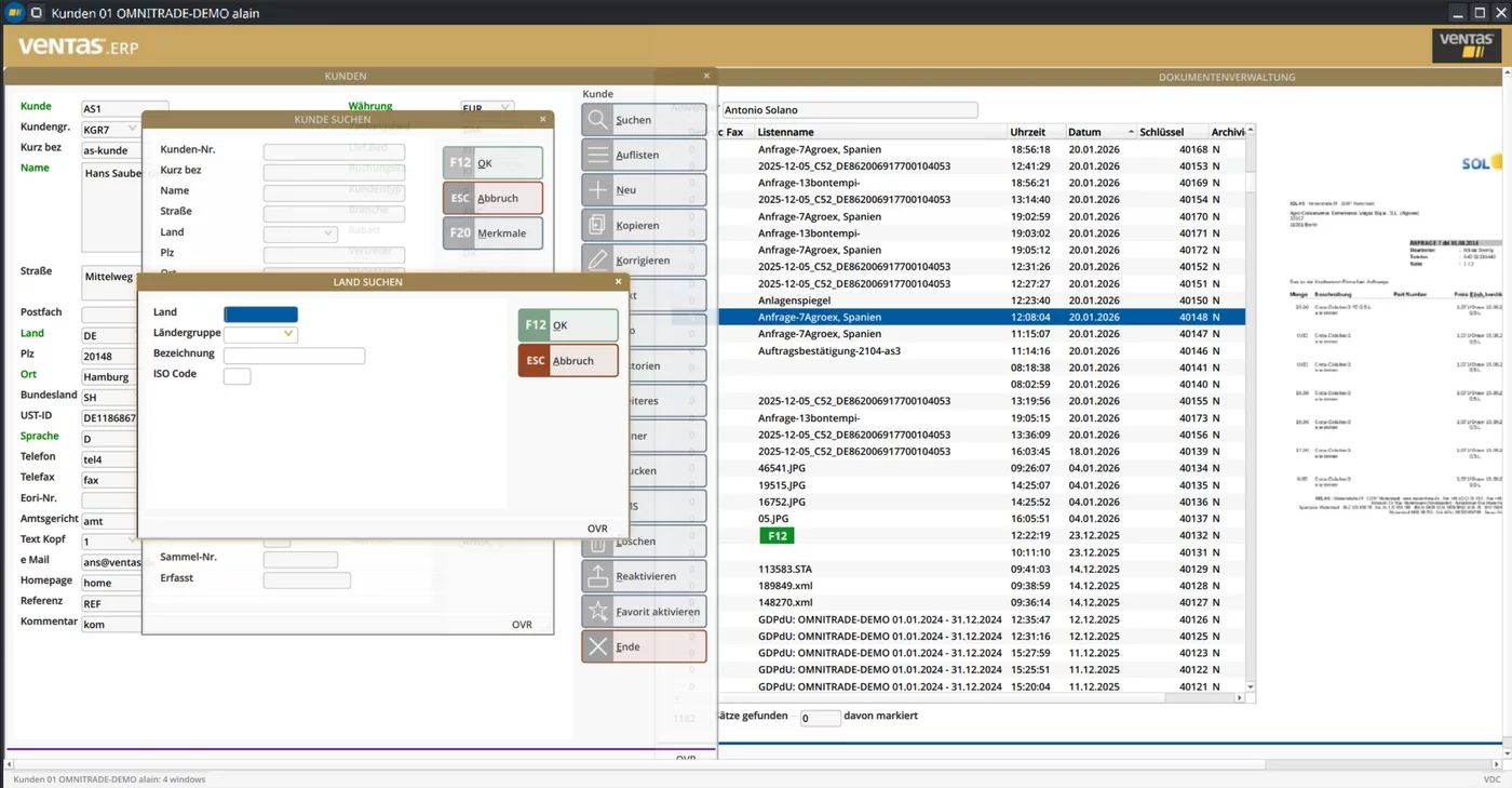
ButtonEdit action opens a lookup — here a customer search raised over the form. The client draws the dialog and its buttons; your code just reacts to the action and fills the field.TextEdit
A multi-line text area, for notes and descriptions.
TextEdit f_notes = FORMONLY.notes, WANTTABS;
The variable behind a TextEdit is usually declared TEXT (or a long CHAR)
in the program.
DateEdit
A date field with a pop-up calendar. The FORMAT attribute controls how the date is
shown in this field, overriding the global DBDATE.
DateEdit f_dob   = FORMONLY.dob TYPE DATE;
DateEdit f_start = FORMONLY.start_date TYPE DATE, FORMAT="yyyy/mm/dd";
DateEdit f_end   = FORMONLY.end_date, NOT NULL, REQUIRED;
ComboBox
A drop-down. You can list the choices statically in the form with ITEMS, or fill
them from the program at run time (shown in chapter 7).
ComboBox f_juice = FORMONLY.juice, ITEMS=("Apple","Orange","Tomato");
CheckBox
A yes/no control. TEXT is the label shown next to the box.
CheckBox f_agree = FORMONLY.agree, TEXT="I accept the terms";
ProgressBar
Shows a value between VALUEMIN and VALUEMAX. Update it from the program with
DISPLAY.
ProgressBar f_prog = FORMONLY.progress, VALUEMIN=0, VALUEMAX=100;
Browser
Embeds a web view — useful for showing HTML help, a report preview, or a map.
Browser f_view = FORMONLY.url;
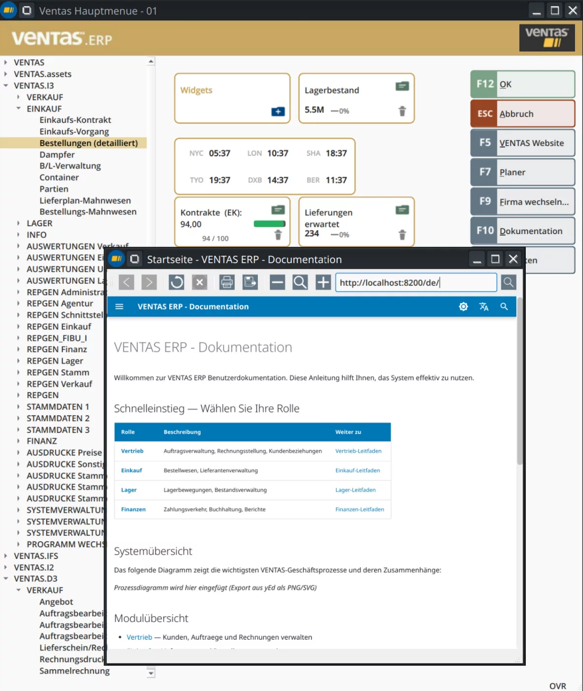
Browser widget hosting live HTML — here the application's own documentation, served locally and shown inside the app window.Field attributes
Attributes go after the variable, separated by commas. Here are the ones you will actually use, grouped by what they do.
Validation and input control
| Attribute | Effect |
|---|---|
REQUIRED |
The field must be filled before the user can continue |
NOT NULL |
The field may not be left empty/NULL |
NOENTRY |
Display-only; the user cannot type in it |
DEFAULT="…" |
Pre-fills a default value |
PICTURE="…" |
Restricts input to a pattern |
INCLUDE=(…) |
Restricts input to the listed values |
AUTONEXT |
Jump to the next field automatically when this one is full |
Appearance and behaviour
| Attribute | Effect |
|---|---|
COLOR=… |
Text colour of the field |
UPSHIFT |
Convert typed text to UPPERCASE |
DOWNSHIFT |
Convert typed text to lowercase |
HIDDEN |
Field exists but is not shown (you can reveal it from code) |
FORMAT="…" |
Display format (dates, numbers) |
TYPE … |
The field's data type, e.g. TYPE INTEGER, TYPE DATE |
Widget-specific
| Attribute | Applies to | Effect |
|---|---|---|
IMAGE="…" |
ButtonEdit |
Icon shown on the button |
ACTION=… |
ButtonEdit |
Action name raised on press |
ITEMS=(…) |
ComboBox |
Static list of choices |
TEXT="…" |
CheckBox |
Label next to the box |
WANTTABS |
TextEdit |
Allow Tab characters in the text |
WANTNORETURNS |
TextEdit |
Reject the Enter key |
VALUEMIN / VALUEMAX |
ProgressBar |
Range of the bar |
A complete worked form
Let's build a small "product entry" form that uses several widgets together. Create
product.per:
DATABASE FORMONLY

SCREEN
{
    Product entry
    ----------------------------------------------------

    Code:        [f_code  ]
    Name:        [f_name                       ]
    Category:    [f_cat            ]
    Price:       [f_price    ]
    Active:      [f_active]

    Description:
    [f_desc                                     ]
    [f_desc                                     ]
    [f_desc                                     ]
}

ATTRIBUTES

Edit     f_code  = FORMONLY.code, UPSHIFT, REQUIRED;
Edit     f_name  = FORMONLY.name, REQUIRED;
ComboBox f_cat   = FORMONLY.category, ITEMS=("Food","Drink","Other");
Edit     f_price = FORMONLY.price TYPE DECIMAL(10,2);
CheckBox f_active = FORMONLY.active, TEXT="Active";
TextEdit f_desc  = FORMONLY.description, WANTTABS;
Compile it:
fcompile -xml product.per
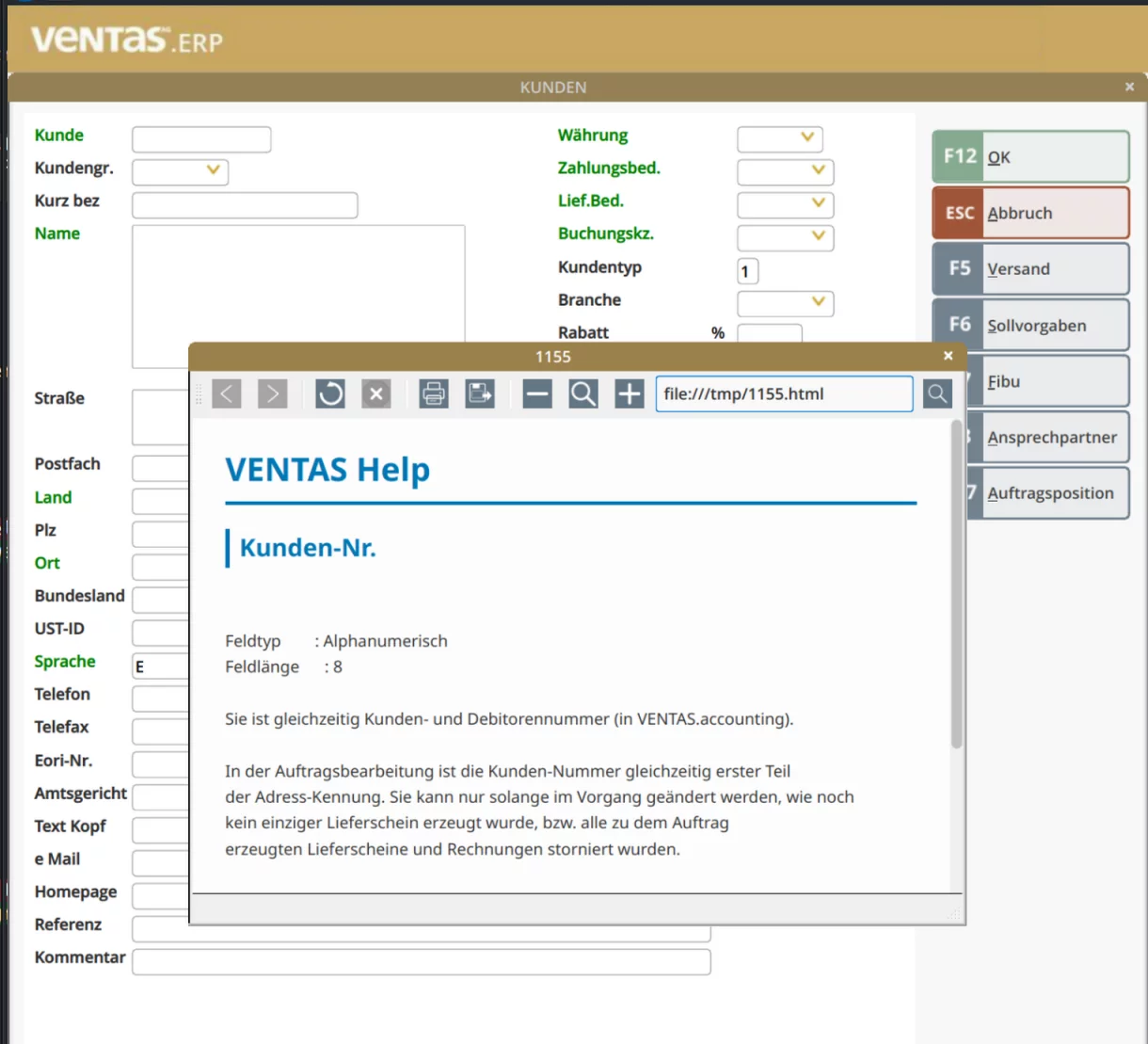
.per file and rendered by the VDC — native widgets, with field-level help on a keypress.The matching program — which opens the form, lets the user fill it, and reads the values back — is exactly what the next chapter is about.
Continue to Screens, Input and Menus.